Wake Up Coffee.
Branding & Identity | Motion Design | Print Design
Project Objectives:
For one of my design courses at The Ohio State University, we could either create a mock brand or rebrand an existing company. I choose to rebrand Roosevelt Coffeehouse, located in Columbus, Ohio.
Programs Used:
Illustrator, Indesign, After Effects, SurveyMonkey

Wake Up Coffee is a nonprofit coffeehouse where proceeds goes to fight hunger, unclean water, and human trafficking. We believe that coffee can taste good as well as do good.

Typography
Iconography
Brand System
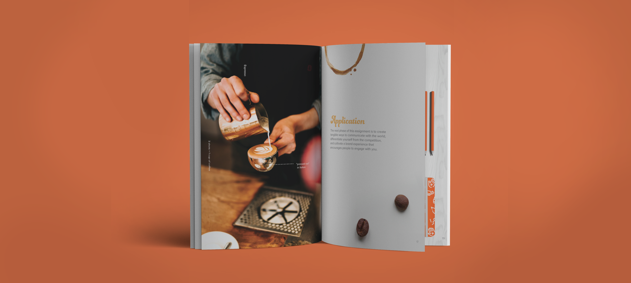
Below are various applications of the new brand system such as ux/ui design, packaging, environmental design, print design, and apparel.


The Process
Initial Mark Sketches & Ideation
Initial Finalized 3 Mark Concepts
Concept 1
Two hands (representing community) come together to form the shape of a coffee bean.
Concept 2
The coffee foam forms into a world, tying together coffee and unity.
Concept 3
A cup of coffee splashes up to form a community of people.
Moodboard
Audience-Testing of Logo
30 participants rated on a scale which term they felt the mark (black and white version) fit more.
30 participants were asked: “If you could only use three words to describe this logo, what would they be?”


